Character Poses:
Last year I was asked to illustrate 3 characters for ABC Adventures Compass Kids Series. The characters consisted of an African American Boy, an Caucasian Girl and a Monster. Originally, they were only going to introduce each chapter and some of the games inside the books. I was thrilled to hear that the publisher liked the characters so much that I was chosen to illustrate the covers as well as represent the series. In total, I illustrated the 3 book covers and 12 character poses. Each book comes with a DVD in which a child can choose one of the characters to learn and play with. Overall, I loved working with the publishers and the printing turned out great for all of the books!
Friday, April 24, 2015
Monday, October 6, 2014
Catapult Learning Book Series
Last year was a super busy year for me. This is just one of many projects I was working on.
As many of you know, I work full time as a Senior Designer/Illustrator at American Greetings during the day and at night, I work freelance. Which means, sleep is a side note most of the year…or at least when there is freelance.
Anyway…my agent was contacted by Trillium Publishing in regards to a multi book series for Catapult Learning's Read Up series. What you see above is just a small sampling of the work I did for them. In total, I illustrated 4 short stories and one, 24 page book. The first image is from the short story "Clover and the Pond Monster." The second image is from another short story called "Quentin's Park Mystery." The rest come from the 24 page book "Partners in the Park." Over all this was quite a challenge but I have to admit that I am happy with how they turned out and hope all of you agree.
Monday, January 27, 2014
Target Halloween Promo
I know it seems weird posting Halloween images in February but, I have been crazy busy since November with my full time job at American Greeting and part time job freelancing.
This promo consisted of 12 designs in all. I am only posting the images I worked on. Being an Illustrator for American Greeting means that you have to be able to replicate a lot of techniques and styles. Well, maybe you don't have to have a lot of techniques and styles but, it definitely makes you a more valuable resource.
As for the technique, I used Photoshop with traditionally painted textures. I shared these textures with the other artist working on this promo so, the technique kept a visually consistency throughout all of the designs.
As for the style, the character's are a little more edge than I normally illustrate but, I like changing things up from time to time.
Friday, October 11, 2013
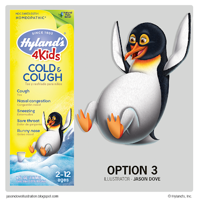
Hyland's 4 Kids
Test Images:
(Never Used)
A little over a year ago, my agent approached me with an opportunity to develop some characters for
the Hyland’s 4 Kids line. I was told that I would have to compete with other artist for the job. I find that this is common with many of my bigger project opportunities.
When I first started the project, My test was to create 2 animal characters (a cheetah and a penguin) along with 2 kid characters in my highly rendered technique.
I was told they wanted to explore both options to see which direction to take. I was so excited to hear I was the artist chosen to finish the project and have my characters represent Hyland's Inc.
As for the winning character, they chose the boy with the stuffed teddy bear. They felt that these characters related more with Moms (their main consumer) compared to the cheetah and penguin characters.
Hyland’s has graciously given me the approval to post the 2 animal characters that were not choose for this project. What you see above is exactly how I presented the final artwork to them.
If you would like to find out more about the Hyland’s 4 Kids line and/or explore some of the fun activity pages featuring my characters, chek out their site here.
I really had a great time working on this project and hope that I have more opportunities like this come my way in the future.
Wednesday, August 21, 2013
Laws for Kids
Image Samples:
Character Breakdown:
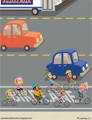
This is a 12 page book I created for Reading A-Z.
They Specialize in publishing digital books that teachers can download in their classrooms and give to the kids to take home to practice reading.
They Specialize in publishing digital books that teachers can download in their classrooms and give to the kids to take home to practice reading.
This particular book focuses on safety. It was written by Maribeth Boelts.
As for the technique, I was asked to work in a vector format. I created the illustrations using Adobe Illustrator CS5. I was also asked to create two versions of the book. One in color and the other in black and white. This gives the teachers and students the option of printing the book out with full or limited color.
As for the technique, I was asked to work in a vector format. I created the illustrations using Adobe Illustrator CS5. I was also asked to create two versions of the book. One in color and the other in black and white. This gives the teachers and students the option of printing the book out with full or limited color.
I have included only a few of the 12 pages along with a character breakdown image of my thoughts as I designed the characters.
Subscribe to:
Comments (Atom)


