Wednesday, May 16, 2012
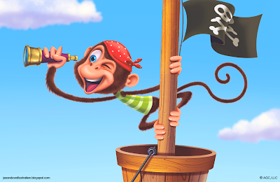
Cover:
Close Up Of Characters:
These images are from a Birthday Card that I created for American Greetings. It is for a pop up card. Most of the characters are very small on the card but, I created them at a much bigger size. I created all of the characters in Photoshop. The first image is the cover of the card without the lettering. I do not have the file with the completed letting. That is why there is space to the left of the monkey. I also did not include an image of the inside background art because it was made for the pop up and looked strange in it's flattened state. I hope you all like how they turned out.
Subscribe to:
Comments (Atom)


